- >>
- Youth

NEW DELHI: I don’t know about you, but my creative juices need a lot of pushing and prodding to get flowing. Tuesdays, for the record, aren’t great for the process -- midweek lethargy sets in and I spend more time stalking people on Instagram than I do actually working. To coax those juices out today, I decided to take a look at some award winning logos, y’know for inspiration.
As I went through a series of logos, I realised that most of them have an inconspicuous design element that is pure genius. An element that at first glance seems entirely quotidian, but when you pay closer attention -- you realize that that seemingly humdrum circle or square actually represents the essence of the company in question.
Here is a list of my favourite logos with a brilliant hidden meaning encapsulated by a seemingly ordinary design element.
Did I miss out on any? Tell me in the comments below.
1. FedEx
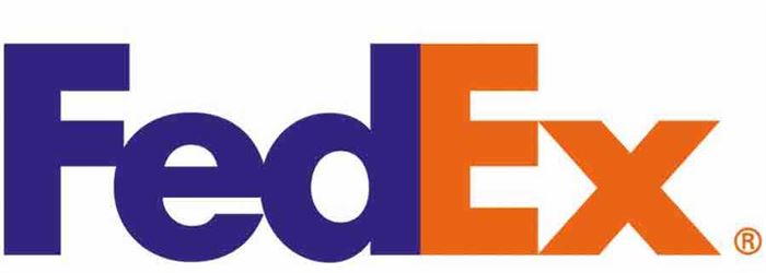
Notice the space between the E and the X. Now note that it is in the shape of an arrow -- representing the logistics company's "direction, speed, and precision".
2. Toblerone
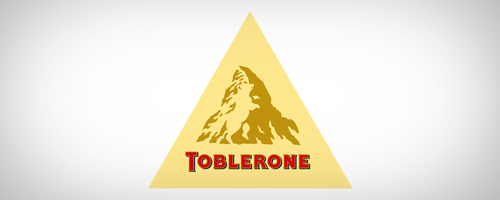
That, my dear Watson, isn’t just an ordinary mountain. Toblerone is located in Bern, Switzerland which is also known as the City of Bears. Do you see the bear in the logo? Focus on the lighter spacing. Genuis!
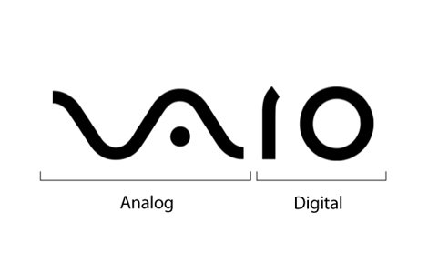
3. Sony Vaio
I love this logo because of how geeky it is. The "V" and "A" represent an analogue signal and the binary "I" and "O" represent a digital one. Combined, the letters spell out Vaio, yes, but also represent the "history and evolution of technology from analogue to digital".
4. Baskin Robbins

What is Basking Robbins famous for? 31 flavours of ice cream, duh! Look carefully and you’ll see that the number 31 is an integral part of the logo.
5. Amazon
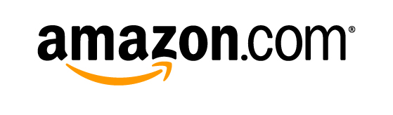
See that arrow at the bottom? What does it represent? A smile: for happy customers? Well, yes, but it also shows that everything from a to z is available on Amazon (and it is!).
6. Le Tour de France

The R forms a man riding a bicycle, that seemingly ordinary circle is the front wheel.
7. Eighty20
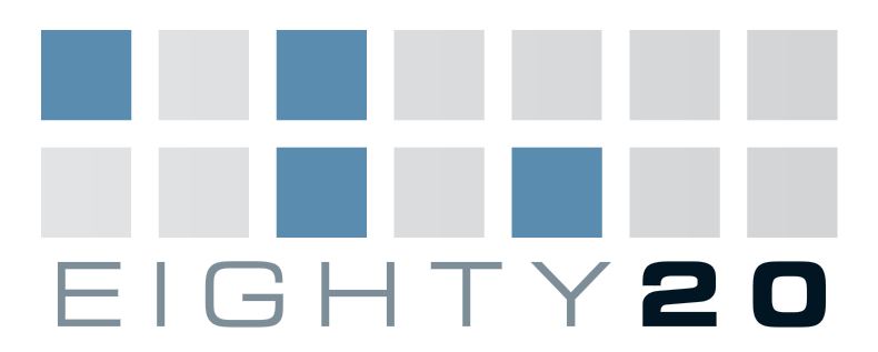
This one’s a tough one. Eighty20 is a data strategy company, and that’s your first clue. The dark squares in the logo represent 1s in binary and the blank ones are zeros. The top line - 1010000 - represents 80 in binary, while the bottom line - 0010100 - is 20. Eighty20.
8. Picasa
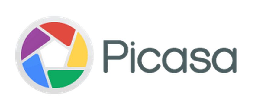
Remember Picasa? A photo storage app or a home for your pictures, Picasa’s logo represents the camera shutter through the coloured shapes and the negative space enclosed between represents a home, or casa.
9. Flight Finder

Note how the logo is two Fs and a plane in the middle.
10. Goodwill

Is it a G or a smiling face?